css 居中方法,CSS实现元素居中技巧汇总
CSS居中方法主要包括以下几种:,1. 使用flex布局:将父元素设置为flex容器,子元素通过align-items和justify-content属性实现水平和垂直居中。,2. 使用grid布局:将父元素设置为grid容器,子元素通过place-items属性实现水平和垂直居中。,3. 使用绝对定位和transform:将子元素通过绝对定位使其左上角位于父元素中心,再通过transform属性调整位置至完全居中。,4. 使用表格布局:将父元素设置为display: table,子元素设置为display: table-cell,并使用vertical-align: middle和text-align: center实现居中。,这些方法各有特点,可以根据具体需求选择合适的方法实现居中效果。
用户提问:我想了解一下CSS中居中的方法,有哪些常用的技巧可以实现水平或垂直居中呢?
CSS居中方法解析
CSS居中是网页设计中非常常见的需求,无论是文本、图片还是其他元素,居中布局都能让页面看起来更加整洁美观,下面我将从几个出发,详细介绍CSS中常用的居中方法。
水平居中
使用margin: 0 auto;
这是最简单的水平居中方法,适用于单行文本或单元素的情况,只需设置元素的margin-left和margin-right为auto,即可实现水平居中。
.center-element {
  margin: 0 auto;
}
使用Flexbox
Flexbox是CSS3中引入的一种布局模型,可以非常方便地实现元素的水平居中,只需将父容器设置为display: flex;,并设置justify-content: center;,子元素就会自动居中。
.parent {
  display: flex;
  justify-content: center;
}
使用Grid布局
Grid布局是另一种强大的布局模型,同样可以实现水平居中,只需将父容器设置为display: grid;,并设置justify-content: center;,子元素也会自动居中。
.parent {
  display: grid;
  justify-content: center;
}
垂直居中
使用position: absolute;
这种方法需要设置父容器的position: relative;,然后设置子元素的position: absolute;,并使用top、left、bottom和right属性来调整位置。
.parent {
  position: relative;
}
.center-element {
  position: absolute;
  top: 50%;
  left: 50%;
  transform: translate(-50%, -50%);
}
使用Flexbox
与水平居中类似,Flexbox也可以实现垂直居中,只需将父容器设置为display: flex;,并设置align-items: center;,子元素就会自动垂直居中。
.parent {
  display: flex;
  align-items: center;
}
使用Grid布局
Grid布局同样可以实现垂直居中,只需将父容器设置为display: grid;,并设置align-items: center;,子元素也会自动垂直居中。
.parent {
  display: grid;
  align-items: center;
}
水平和垂直同时居中
使用Flexbox
在Flexbox中,水平和垂直居中可以同时实现,只需将父容器设置为display: flex;,并设置justify-content: center;和align-items: center;,子元素就会同时水平和垂直居中。
.parent {
  display: flex;
  justify-content: center;
  align-items: center;
}
使用Grid布局
Grid布局同样可以实现水平和垂直同时居中,只需将父容器设置为display: grid;,并设置justify-content: center;和align-items: center;,子元素也会同时水平和垂直居中。
.parent {
  display: grid;
  justify-content: center;
  align-items: center;
}
居中多个元素
使用Flexbox
在Flexbox中,可以同时居中多个元素,只需将父容器设置为display: flex;,并设置justify-content: center;和align-items: center;,多个子元素就会同时水平和垂直居中。
.parent {
  display: flex;
  justify-content: center;
  align-items: center;
}
.child1 {
  /* 样式 */
}
.child2 {
  /* 样式 */
}
使用Grid布局
Grid布局同样可以实现多个元素的居中,只需将父容器设置为display: grid;,并设置justify-content: center;和align-items: center;,多个子元素也会同时水平和垂直居中。
.parent {
  display: grid;
  justify-content: center;
  align-items: center;
}
.child1 {
  /* 样式 */
}
.child2 {
  /* 样式 */
}
居中表格
使用text-align: center;
对于简单的表格,可以使用text-align: center;属性来实现水平居中。
table {
  text-align: center;
}
使用Flexbox
对于复杂的表格,可以使用Flexbox来实现水平和垂直居中,只需将父容器设置为display: flex;,并设置justify-content: center;和align-items: center;,表格就会同时水平和垂直居中。
.parent {
  display: flex;
  justify-content: center;
  align-items: center;
}
.table {
  /* 表格样式 */
}
就是CSS中常用的居中方法,希望对您有所帮助,在实际开发中,可以根据具体需求选择合适的方法来实现居中布局。
其他相关扩展阅读资料参考文献:
水平居中方法
居中
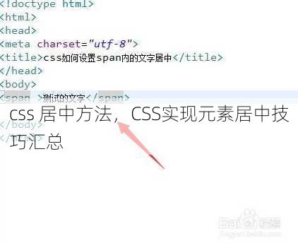
使用 text-align: center 是最基础的水平居中方式,适用于内联元素(如文字、图片)或单行元素,将父容器的 text-align 设置为 center,子元素会自动在水平方向居中。
.parent {
  text-align: center;
}
块级元素居中
块级元素(如 div、p)的水平居中需结合 margin: 0 auto,但前提是元素有明确的宽度。
.box {
  width: 50%;
  margin: 0 auto;
}
若宽度未定义,需先设置 width 或使用 display: inline-block,否则 margin: 0 auto 无法生效。
图片或单行元素居中
对于图片或单行元素,直接使用 display: block 和 margin: 0 auto 可实现水平居中,若图片需要响应式,可结合 width: 100% 和 display: block,避免因宽度变化导致居中失效。
垂直居中方法
单行文本垂直居中
通过 line-height 实现垂直居中,需将父容器高度固定,并设置 line-height 等于高度。
.parent {
  height: 100px;
  line-height: 100px;
}
此方法仅适用于单行文本,多行文本需结合 display: flex 或 table-cell。
多行文本垂直居中
使用 display: flex 并设置 align-items: center,可让多行文本在垂直方向居中。
.parent {
  display: flex;
  align-items: center;
  height: 200px;
}
若需兼容旧版浏览器,可考虑使用 table-cell 布局,但需注意 vertical-align 的使用限制。
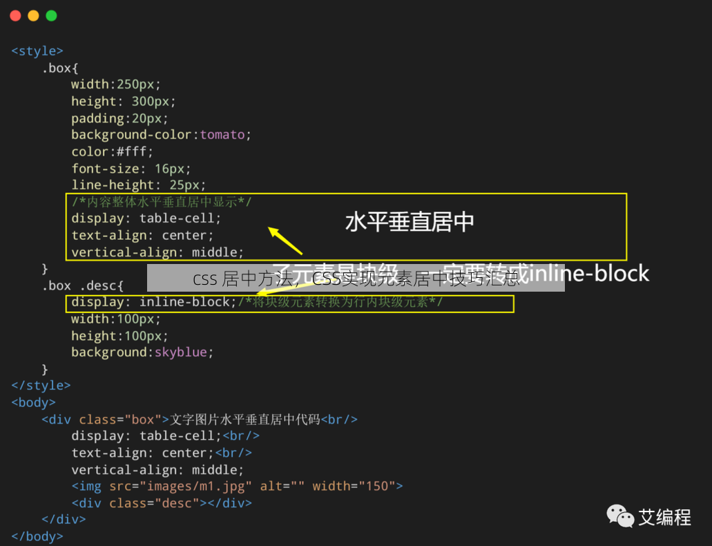
使用 table-cell 垂直居中
将父容器设置为 display: table-cell,并设置 vertical-align: middle,可实现垂直居中。
.parent {
  display: table-cell;
  vertical-align: middle;
  height: 100px;
}
此方法需配合 display: table 父容器使用,且不支持响应式布局,适合固定高度场景。
同时居中方法
Flexbox的 center 属性
使用 display: flex 并设置 justify-content: center 和 align-items: center,可同时实现水平和垂直居中。
.parent {
  display: flex;
  justify-content: center;
  align-items: center;
  height: 100px;
}
Flexbox是现代布局首选方案,兼容性良好且代码简洁,适合大多数场景。
Grid的 auto-center 属性
使用 display: grid 并设置 place-items: center,可同时实现水平和垂直居中。
.parent {
  display: grid;
  place-items: center;
  height: 100px;
}
Grid布局在响应式设计中优势明显,但需注意浏览器兼容性,尤其在低版本IE中可能不支持。
绝对定位结合 transform
通过绝对定位和 transform: translate(-50%, -50%) 实现精准居中,需先设置父容器为相对定位,子元素为绝对定位。
.parent {
  position: relative;
  height: 100px;
}
.child {
  position: absolute;
  top: 50%;
  left: 50%;
  transform: translate(-50%, -50%);
}
此方法适用于需要动态调整位置的场景,但需注意父容器的尺寸和定位关系。
Flexbox与Grid布局的进阶应用
Flexbox的弹性伸缩特性
Flexbox通过 flex-grow 和 flex-shrink 实现元素自适应居中,
.parent {
  display: flex;
  justify-content: center;
  align-items: center;
}
.child {
  flex: 1;
}
弹性布局可自动分配空间,适合响应式设计和复杂排列需求,但需避免过度使用导致布局混乱。
Grid的行列对齐控制
Grid布局通过 align-items 和 justify-content 控制子元素对齐方式,
.parent {
  display: grid;
  grid-template-columns: 1fr;
  grid-template-rows: 1fr;
  align-items: center;
  justify-content: center;
}
行列对齐属性可灵活调整元素位置,适合需要多维布局的场景,但需注意网格的定义和子元素数量匹配。
嵌套Flexbox实现复杂居中
在父容器使用Flexbox后,子容器可通过嵌套Flexbox实现更精细的居中控制,
.parent {
  display: flex;
  justify-content: center;
}
.child {
  display: flex;
  align-items: center;
}
嵌套布局可分层处理对齐需求,但需避免层级过多导致性能下降,适合需要多级居中的场景。
其他特殊场景居中技巧
使用 transform: translate 居中
通过 transform: translate(-50%, -50%) 实现元素中心对齐,需结合绝对定位。
.parent {
  position: relative;
}
.child {
  position: absolute;
  top: 50%;
  left: 50%;
  transform: translate(-50%, -50%);
}
此方法适用于需要精确控制偏移量的场景,但需注意父容器的尺寸和定位。
负边距实现居中
通过 margin: auto 和负边距结合实现居中,
.box {
  margin: 0 auto;
  width: 50%;
}
负边距方法在特定场景下有效,但需确保父容器有足够的空间容纳元素。
使用 position: absolute 与 left: 50%
通过 left: 50% 和 margin-left: -half-width 实现水平居中,
.box {
  position: absolute;
  left: 50%;
  margin-left: -50px;
}
此方法需手动计算元素宽度,适合固定尺寸元素,但灵活性较低。
响应式居中兼容方案
在响应式设计中,使用 flexbox 或 grid 比传统方法更高效,
@media (max-width: 600px) {
  .parent {
    display: flex;
    flex-direction: column;
    align-items: center;
  }
}
响应式布局需结合媒体查询和布局模式切换,确保不同设备下的兼容性。
考虑浏览器兼容性
旧版浏览器(如IE8)不支持Flexbox和Grid,需使用 table-cell 或 inline-block 作为替代方案。
.parent {
  display: table;
}
.child {
  display: table-cell;
  vertical-align: middle;
}
兼容性需在开发初期考虑,避免因浏览器差异导致布局异常。
选择合适的居中方法
CSS居中方法的选择需根据具体场景和需求灵活调整,水平居中可通过 text-align、margin 或 display: block 实现,垂直居中则依赖 line-height、flex 或 table-cell,同时居中时,Flexbox和Grid是首选方案,而绝对定位结合 transform 适合需要精准控制的场景。在响应式设计中,优先使用Flexbox或Grid布局,兼顾兼容性与灵活性,掌握这些方法,不仅能提升代码效率,还能确保不同设备和浏览器下的良好体验。
“css 居中方法,CSS实现元素居中技巧汇总” 的相关文章
欧拉函数在线计算,一键获取欧拉函数值——在线计算服务
欧拉函数在线计算是一种利用特定算法快速求解给定正整数n的欧拉函数φ(n)值的方法,该方法基于欧拉函数的定义,即计算小于等于n的正整数中与n互质的数的个数,用户只需输入一个正整数,在线计算器便会输出其欧拉函数值,广泛应用于数论研究和密码学等领域。揭秘数字世界的“黄金比例” 用户解答: 大家好,我是...
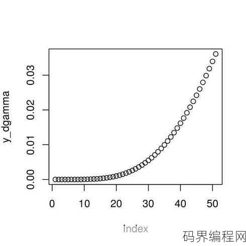
r语言gamma函数,R语言中Gamma函数的应用与计算
R语言中的gamma函数用于计算伽马分布的概率密度函数、累积分布函数和逆分布函数,该函数可以处理连续的伽马分布,其中形状参数α和尺度参数β决定了分布的形状和位置,通过指定这些参数,可以计算特定值下的概率密度、累积概率或逆概率,这对于统计建模和数据分析非常有用。 你好,我是一名数据分析初学者,最近在...
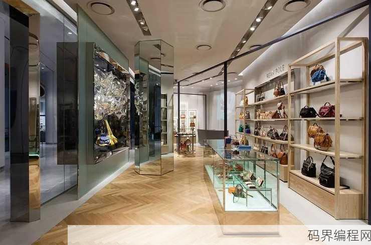
beanpole滨波专卖店,beanpole滨波品牌专卖店,潮流服饰尽在掌握
beanpole滨波专卖店是一家专注于时尚服饰的零售店,提供多种风格的单品,包括服装、鞋履和配饰,店内设计现代且充满活力,致力于为顾客提供高品质的购物体验,beanpole以其简洁的线条和独特的设计理念,吸引了一大批追求时尚潮流的消费者,店内商品涵盖男女装,适合各种场合穿着,旨在满足不同年龄层和风格...
beanpole怎么读,Beanpole发音指南
"beanpole"这个词的发音是:bean-uh-pohl,在这个词中,"bean"发音类似于“bean”这个词,而"pole"发音类似于“pole”这个词,整体上,它是一个两个音节的单词,读作bean-uh-pohl。beanpole怎么读 用户解答 嗨,大家好!最近我在学英语的时候遇到了一...

数据库事务,数据库事务管理原理与实践
数据库事务是数据库管理系统执行过程中的一个逻辑单位,它包含了一系列的操作,这些操作要么全部成功,要么全部失败,事务具有原子性、一致性、隔离性和持久性(ACID属性),它确保了数据库中数据的一致性和完整性,防止了由于错误或并发操作导致的数据不一致问题,在数据库操作中,事务通常由BEGIN TRANSA...
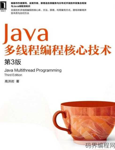
java核心技术第几版好,Java核心技术最新版哪一本更适合学习?
《Java核心技术》第几版最好取决于您的需求,第10版是最新版,涵盖了Java 17的新特性,适合想要学习最新Java技术的读者,但如果您更关注基础和经典内容,第8版也是一个不错的选择,建议您根据自己的学习目标和Java版本需求来选择合适的版本。 大家好,我是一名Java开发者,最近在准备复习和巩...
- 最新发布
-
1分钟前
9分钟前
15分钟前
23分钟前
30分钟前
- 热门阅读
-

903 浏览学习方法

242 浏览源码资料

224 浏览学习方法
219 浏览数据库
213 浏览编程语言