html居中对齐怎么设置,HTML元素居中对齐设置方法
在HTML中,要实现文本或元素居中对齐,可以使用以下几种方法:,1. 使用CSS样式text-align: center;来使文本居中对齐。,2. 对于块级元素,可以使用margin: 0 auto;来水平居中对齐。,3. 使用CSS Flexbox布局,将父元素设置为display: flex;,子元素设置为justify-content: center;来居中对齐。,若要使一段文本居中对齐,可以在`标签中添加style="text-align: center;"属性,或者在外部CSS文件中添加.center-text { text-align: center; }并给相应的标签添加类名center-text`。
嗨,大家好!今天我来和大家分享一下HTML中居中对齐的设置方法,我在做网页设计的时候,经常会遇到需要文字或元素居中对齐的情况,这里有一些简单有效的方法可以分享给大家。
我将从几个详细讲解如何实现HTML元素的居中对齐。
一:文本水平居中
使用text-align: center;属性
在<div>、<p>、<h1>等块级元素上设置text-align: center;即可实现文本的水平居中。
<div style="text-align: center;">
  这是居中的文本。
</div>
使用margin: 0 auto;属性
对于宽度已知的块级元素,可以通过设置左右边距为auto来实现水平居中。
<div style="width: 300px; margin: 0 auto;">
  这是居中的文本。
</div>
使用Flexbox
Flexbox布局可以非常方便地实现文本的水平居中。
<div style="display: flex; justify-content: center;">
  这是居中的文本。
</div>
二:元素垂直居中
使用line-height属性
对于单行文本,可以通过设置line-height等于容器高度来实现垂直居中。
<div style="height: 100px; line-height: 100px;">
  这是居中的文本。
</div>
使用position: absolute;属性
通过绝对定位,可以将元素放置在容器的中心。
<div style="position: relative; height: 200px;">
  <div style="position: absolute; top: 50%; left: 50%; transform: translate(-50%, -50%);">
    这是居中的元素。
  </div>
</div>
使用Flexbox
Flexbox布局同样可以轻松实现元素的垂直居中。
<div style="display: flex; align-items: center; justify-content: center; height: 200px;">
  这是居中的元素。
</div>
三:表格居中
使用margin: 0 auto;属性
对于宽度已知的表格,可以通过设置左右边距为auto来实现水平居中。
<div style="width: 300px; margin: 0 auto;">
  <table>
    <tr>
      <td>单元格1</td>
      <td>单元格2</td>
    </tr>
  </table>
</div>
使用position: absolute;属性
通过绝对定位,可以将表格放置在容器的中心。
<div style="position: relative; height: 200px;">
  <table style="position: absolute; top: 50%; left: 50%; transform: translate(-50%, -50%);">
    <tr>
      <td>单元格1</td>
      <td>单元格2</td>
    </tr>
  </table>
</div>
使用Flexbox
Flexbox布局同样可以方便地实现表格的居中。
<div style="display: flex; align-items: center; justify-content: center; height: 200px;">
  <table>
    <tr>
      <td>单元格1</td>
      <td>单元格2</td>
    </tr>
  </table>
</div>
四:图片居中
使用margin: 0 auto;属性
对于宽度已知的图片,可以通过设置左右边距为auto来实现水平居中。
<div style="width: 300px; margin: 0 auto;">
  <img src="image.jpg" alt="图片" style="width: 100%;">
</div>
使用position: absolute;属性
通过绝对定位,可以将图片放置在容器的中心。
<div style="position: relative; height: 200px;">
  <img src="image.jpg" alt="图片" style="position: absolute; top: 50%; left: 50%; transform: translate(-50%, -50%);">
</div>
使用Flexbox
Flexbox布局可以轻松实现图片的居中。
<div style="display: flex; align-items: center; justify-content: center; height: 200px;">
  <img src="image.jpg" alt="图片" style="width: 100%;">
</div>
五:按钮居中
使用margin: 0 auto;属性
对于宽度已知的按钮,可以通过设置左右边距为auto来实现水平居中。
<div style="width: 300px; margin: 0 auto;">
  <button>点击我</button>
</div>
使用position: absolute;属性
通过绝对定位,可以将按钮放置在容器的中心。
<div style="position: relative; height: 200px;">
  <button style="position: absolute; top: 50%; left: 50%; transform: translate(-50%, -50%);">点击我</button>
</div>
使用Flexbox
Flexbox布局可以方便地实现按钮的居中。
<div style="display: flex; align-items: center; justify-content: center; height: 200px;">
  <button>点击我</button>
</div>
通过以上方法,我们可以轻松地在HTML中实现各种元素的居中对齐,希望这篇文章对大家有所帮助!
其他相关扩展阅读资料参考文献:
文本居中对齐的实现方法
文本居中是网页设计中最常见的需求之一,可通过多种方式实现,具体取决于对齐目标(水平/垂直)和应用场景。
1 水平居中
1.1 使用text-align属性
直接为父容器设置 text-align: center,即可让子元素中的文本内容水平居中。
.container {
  text-align: center;
}
此方法适用于内联元素(如文字、span)或行内块元素(如图片、按钮)。
1.2 利用Flexbox布局
将父容器设置为 display: flex,并添加 justify-content: center,可实现子元素的水平居中。
.container {
  display: flex;
  justify-content: center;
}
Flexbox还支持垂直居中,只需添加 align-items: center。
1.3 多行文本垂直居中
对于多行文本,需结合 line-height 与容器高度。
.text-block {
  height: 100px;
  line-height: 100px;
}
此方法要求文本高度与容器高度一致,否则会出现偏差。
图片居中对齐的技巧
图片居中需要考虑其显示方式(块级元素或内联元素),并根据需求选择不同的实现方式。
1 水平居中
将图片设置为 display: block 并使用 margin: 0 auto,可实现水平居中。
img {
  display: block;
  margin: 0 auto;
}
注意:图片必须为块级元素才能生效,否则需调整CSS属性。
2 垂直居中
通过 position: absolute 和 transform: translateY 实现。
.parent {
  position: relative;
  height: 200px;
}
img {
  position: absolute;
  top: 50%;
  transform: translateY(-50%);
}
此方法需父容器设置为相对定位,图片设置为绝对定位。
3 响应式图片居中
使用 object-fit: cover 保持图片比例,结合 margin: auto 实现居中。
img {
  width: 100%;
  height: auto;
  object-fit: cover;
  display: block;
  margin: 0 auto;
}
确保图片容器有明确尺寸,避免因尺寸不固定导致居中失效。
块级元素居中的解决方案
块级元素(如div、section)居中需要根据布局方式选择不同的方法。
1 使用margin: auto
设置块级元素为 display: block,并给左右外边距设为 auto。
.block {
  display: block;
  margin: 0 auto;
}
此方法仅适用于水平居中,垂直居中需额外设置。
2 Flexbox布局
将父容器设为 display: flex,并添加 justify-content: center 和 align-items: center。
.parent {
  display: flex;
  justify-content: center;
  align-items: center;
  height: 100vh;
}
此方法可同时实现水平和垂直居中,适合现代响应式设计。
3 Grid布局
使用 display: grid 和 place-items: center 实现双向居中。
.parent {
  display: grid;
  place-items: center;
  height: 100vh;
}
Grid布局语法简洁,但需注意浏览器兼容性。
CSS属性与定位的组合应用
某些复杂场景需要结合CSS属性与定位技术实现精准居中。
1 transform: translate
通过 transform: translate(-50%, -50%) 实现元素中心对齐。
.element {
  position: absolute;
  top: 50%;
  left: 50%;
  transform: translate(-50%, -50%);
}
此方法适合需要绝对定位的元素,但需确保父容器有明确尺寸。
2 absolute定位与padding
将父容器设置为 position: relative,子元素使用 position: absolute 并设置 top: 0、left: 0、right: 0、bottom: 0,再通过 margin: auto 实现居中。
.parent {
  position: relative;
  padding: 0;
}
.child {
  position: absolute;
  width: 200px;
  height: 100px;
  margin: auto;
}
注意:子元素需有固定尺寸,否则无法准确计算居中位置。
3 table-cell布局
将父容器设为 display: table,子元素设为 display: table-cell,再使用 vertical-align: middle。
.parent {
  display: table;
  width: 100%;
  height: 100vh;
}
.child {
  display: table-cell;
  vertical-align: middle;
  text-align: center;
}
此方法适用于表格布局场景,但可能影响其他布局方式。
常见误区与避坑指南
在实际开发中,许多开发者因误解导致居中失效,需注意以下问题。
1 忘记设置元素为块级
若元素未设置为 display: block 或 display: inline-block,margin: auto 无法生效。
img {
  margin: 0 auto; /* 仅当img为块级元素时生效 */
}
2 未明确容器尺寸
使用 position: absolute 时,若父容器未设置 position: relative 或 height,定位会失效。
.parent {
  position: relative; /* 必须设置 */
}
.child {
  position: absolute;
  top: 50%;
  left: 50%;
  transform: translate(-50%, -50%);
}
3 误用inline元素
将块级元素(如div)直接设置为 text-align: center,只会让文本居中,而非元素本身。
.container {
  text-align: center; /* 仅影响文本,不影响div位置 */
}
4 忽视响应式适配
在移动端或不同屏幕尺寸下,未调整居中策略可能导致布局错乱。
@media (max-width: 600px) {
  .block {
    margin: 0 auto; /* 移动端需重新计算尺寸 */
  }
}
5 层叠上下文干扰
若元素被嵌套在多个定位上下文中,需检查 z-index 或 position 属性是否冲突。
HTML居中对齐的核心在于理解元素类型、布局方式和CSS属性的协同作用。text-align 和 margin: auto 是基础工具,而 Flexbox、Grid 和 transform 提供了更灵活的解决方案,开发时需根据具体需求选择合适方法,并注意容器尺寸、元素类型和响应式适配,才能实现精准且稳定的居中效果。
“html居中对齐怎么设置,HTML元素居中对齐设置方法” 的相关文章
织梦pt,织梦PT,探索虚拟世界的新篇章
织梦PT是一款专注于创意和梦想实现的应用平台,它为用户提供了一个展示自我、交流灵感、合作创作的空间,用户可以在这里发布自己的作品,参与各种创意挑战,与志同道合的人互动,共同探讨和实现各自的梦想,平台还提供丰富的资源和工具,助力用户从构思到成品的全过程,激发创意潜能,促进个人成长与社区发展。织梦PT—...
switch语句判断成绩java,Java中switch语句实现成绩判断
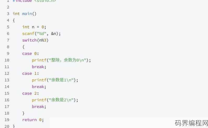
Java中的switch语句可以用来根据成绩判断不同的结果,以下是一个简单的示例:,``java,int score = 85; // 假设这是学生的成绩,switch (score / 10) {, case 10:, case 9:, System.out.printl...
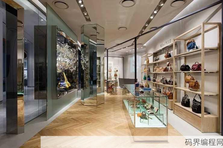
beanpole滨波专卖店,beanpole滨波品牌专卖店,潮流服饰尽在掌握
beanpole滨波专卖店是一家专注于时尚服饰的零售店,提供多种风格的单品,包括服装、鞋履和配饰,店内设计现代且充满活力,致力于为顾客提供高品质的购物体验,beanpole以其简洁的线条和独特的设计理念,吸引了一大批追求时尚潮流的消费者,店内商品涵盖男女装,适合各种场合穿着,旨在满足不同年龄层和风格...
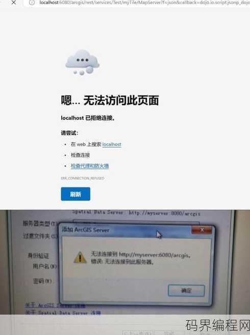
数据库连接不上服务器,数据库连接故障,服务器连接失败排查指南
数据库连接失败,可能是由于服务器不可达、网络问题、服务器配置错误或数据库服务未启动等原因导致,建议检查网络连接、服务器状态、数据库服务是否正常运行,并确保数据库配置正确,如果问题持续存在,可能需要进一步排查服务器日志或寻求技术支持。常见原因及解决方案 用户解答: 大家好,最近我在使用数据库时遇到...
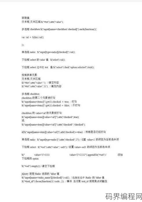
select标签有哪些属性,select标签详细属性解析
select标签在HTML中用于创建下拉列表,它拥有以下常用属性:,1. name:定义下拉列表的名称,用于表单数据提交。,2. size:指定下拉列表中可见的选项数量。,3. multiple:允许用户选择多个选项(仅适用于单选列表)。,4. disabled:禁用下拉列表,使其不可用。,5. r...

成品网站crm短视频,打造高效客户关系管理,成品网站CRM短视频教程
本视频展示了一个成品网站的CRM系统操作流程,视频中详细介绍了如何注册、登录CRM账户,以及如何管理客户信息、销售线索、跟进记录等,通过直观的操作演示,用户可以快速上手,提高工作效率,实现客户关系管理的自动化和智能化。 “我最近在找一款适合我们公司的CRM系统,看了很多成品网站,但感觉都比较复杂,...
- 最新发布
-
2分钟前
5分钟前
13分钟前
20分钟前
27分钟前
- 热门阅读
-

912 浏览学习方法

243 浏览源码资料
224 浏览学习方法
219 浏览数据库
213 浏览编程语言